567 THE ARTIST by The Artist: Gavin Beattie


Though Graphic Design work is my main bread and butter, I’ve also set up Irish Art Prints – limited edition, hand-pulled silkscreen prints based on original photographs taken throughout Ireland and manipulated in order to create simplified colour separations suitable for silkscreen printing.

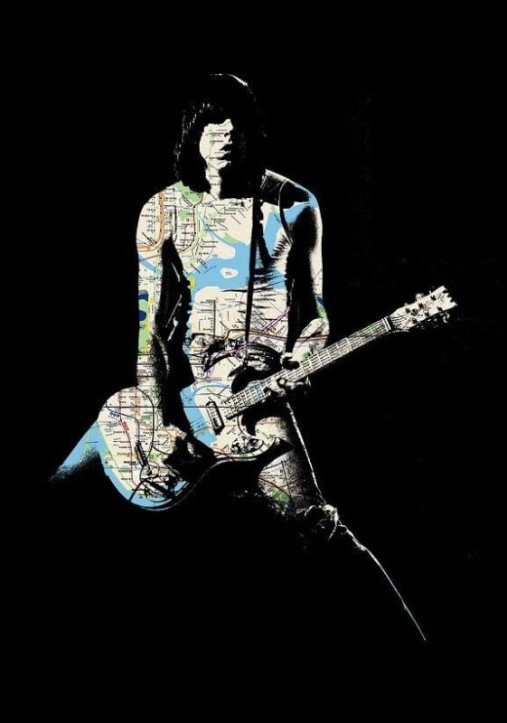
Johnny – FTLONY (9 colour screen print/59cm x 42cm/Edition of 45)

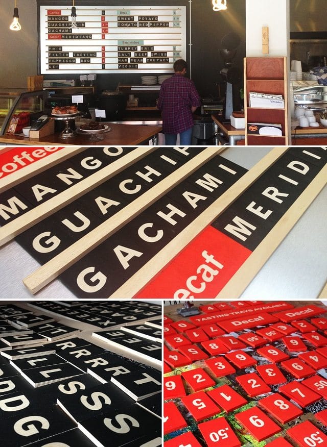
3FE Coffee – Price board (Handmade tile and rail system/screen printed beech ply tiles)

Belfast screenprint (4 colour screen print/40cm x 50cm/Edition of 40)

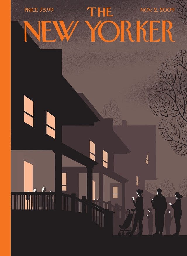
New Yorker cover 11/09 (Chris Ware)
Screaming Hand (Jim Phillips c.1973)
There Will be Blood (Olly Moss/movie poster 2010)

THE ARTIST by The Artist: Gavin Beattie
To cut a long story short I was born in Rathdown Park, my father was an architect  and my mother an illustrator – so I guess it was inevitable I would end up with a creative career. I drew a lot as a child as well as being obsessed with collage, cutting and pasting images from newspapers and magazines.
 and my mother an illustrator – so I guess it was inevitable I would end up with a creative career. I drew a lot as a child as well as being obsessed with collage, cutting and pasting images from newspapers and magazines.
Pic: Killian Broderick
After secondary school I studied Fine Art Printmaking in Crawford College, Cork, and after graduating and realising that Fine Art wasn’t going to pay the bills, I took up an apprenticeship of sorts in a Dublin design studio.
I worked there for 12 years and developed skills in Graphic Design, Typography, Brand Identity, Copywriting and Illustration, eventually leaving to set up my own Graphic Design business, at my home studio in Delgany, back in 2010.
 One of the main skills I took with me from college was screen printing and I now have my own basic silkscreen set up at home.

Designing and hand-printing posters for bands playing various venues in Dublin was initially a part-time hobby I had until setting up Tiny Little Horse in 2006 with a college friend, Bren Byrne.

Bernie Sanders & wife Jane O’Meara Sanders Gavin Beattie print Liberty Hall with SIPTU’s Ethel Buckley and John King MAY25
Since 2006 Tiny Little Horse has designed and hand-printed over 70 posters for all sorts of bands, from local (Kid Blunt, Cujo Family, Backhanders) to more well known names like Morrissey, Feist, Eagles of Death Metal, David Grey and of course, everyone’s favourite, Genghis Tron.
Though Graphic Design work is my main bread and butter, I’ve also set up Irish Art Prints – limited edition, hand-pulled silkscreen prints based on original photographs taken throughout Ireland and manipulated in order to create simplified colour separations suitable for silkscreen printing.  I’m working my way across the country, starting local, and have so far covered Greystones, Delgany, Bray, Dublin and Galway, and am currently working on a Belfast print.

My Work…
Johnny
Johnny – FTLONY (9 colour screen print/59cm x 42cm/Edition of 45)
This print was for a group show I took part in at The Bottleneck Gallery in Brooklyn, New York last year. The brief was simple, it just had to be “about New York”. So I took the thing that says “New York” the most to me – The Ramones – and combined that imagery with the very graphic detailing of the New York subway system map. The subway map comprises 8 separate colours which I printed individually, finally overlaying everything with a solid black. Printing this was interesting because visually it looked very abstract until the final colour went down and tied it all together. It took about 2 months to print.
More info here.
3FE Coffee
3FE Coffee – Price board (Handmade tile and rail system/screen printed beech ply tiles)
I was asked to come up with an easy-to-use price board system for 3FE Coffee on Lower Grand Canal Street in Dublin. They had been using a chalkboard initially but as their coffee menu can change up to 3 times a day they needed a system that was simple to use, legible and didn’t rely on every staff member having impeccable handwriting.
This was a fun project to work on, a joiner friend built the main board and rail system while I hand-printed hundreds of business card sized, 6mm thick birch ply tiles. The colours follow 3FE’s brand and the birch ply fits in well to the café which has a lot of scaffolding poles and ply furniture. More info here.

Belfast
Belfast screenprint (4 colour screen print/40cm x 50cm/Edition of 40)
Belfast will be the 6th in the Irish Art Prints series and should be printed and ready to go in a few weeks. I chose Belfast as my wife is from there originally, as was my Grandmother. Rather than represent more popular sights like the Dockyards, Titanic Quarter and so on I went for The Botanic Gardens. The Gardens really are this picturesque and tidy, the only Photoshopped element is the weather. More info here.
For more, click on the pic.
My Influences…
Chris Ware
New Yorker cover 11/09 (Chris Ware)
I’ve never been hugely into comics but if I had to pick a favourite comic book artist it would be Chicago’s Chris Ware. Everything about his work appeals to me from his subdued, earthy colour palettes to his dark, introspective humour. His work can be quite minimal and at times have no text at all.
This cover he did for the New Yorker in 2009 says so much but in the simplest terms. Part of the challenge of creating gigposters for me is to convey a message either about the band, their name or even a subject covered lyrically – in the most simplistic, graphic way. Ware does just this perfectly in this piece.

Jim Phillips
Screaming Hand (Jim Phillips c.1973)
The Screaming Hand, designed by Jim Phillips in 1973, is the main logo of the Santa Cruz skateboard brand.The logo has become a skateboarding icon and is recognised widely throughout the skateboarding community. I think along with record sleeves and band logos, graphic design in skateboarding was one of the main reasons I ended up working as a Graphic designer. This image will be instantly recognisable to anyone who had any kind of involvement in skateboarding growing up in the 1980s.
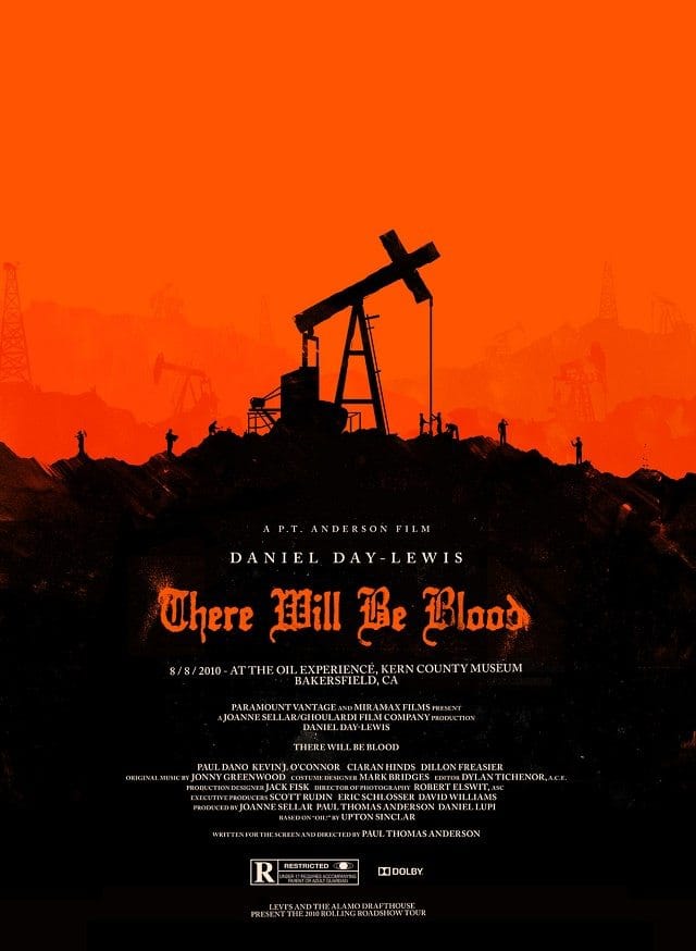
Olly Moss